Rip Magnum Press Logo
Open the image in a new window.
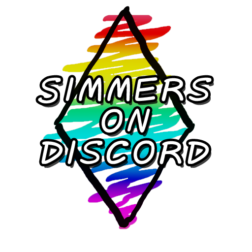
A logo designed for an online chat group. The rhomboid shape and rainbow were intended to match existing branding for the group.
Usually, I don't like to use too many colors in a logo. However in this case the rainbow matched existing branding and it is treated nearly as a single color. Special care was taken to ensure the logo would be readable and function in multiple applications.